Words and Marks: Writing in Modern Art
Six artists who made language, script, and written signs into visual subjects between 1912 and 1966.
“6 modern artists dealing with literacy”
This exhibition traces how modern artists moved writing from the margins into the center of the picture. Whether through literal text, gestural marks that mimic handwriting, or compositions structured like pages, these works treat language as a primary visual material rather than a secondary label or title. The shift reflects a broader modernist conviction that art could absorb and transform the everyday act of writing itself.
The works span from Dada collage, which embedded actual printed matter into fine art, to Abstract Expressionism, where the artist's hand leaves traces that read almost like a personal script. Some pieces use recognizable words or letters; others consist of marks and rhythms so insistent they demand to be read as a kind of writing, even when no words appear. In each case, the artist has chosen to make literacy, notation, and the visual fact of the written mark central to what the work does.
Together, these six pieces demonstrate that modern art did not turn away from language but rather seized it as a formal and conceptual resource. Writing is not decoration here; it is the subject and the substance.
Walk through in order, 6 works.
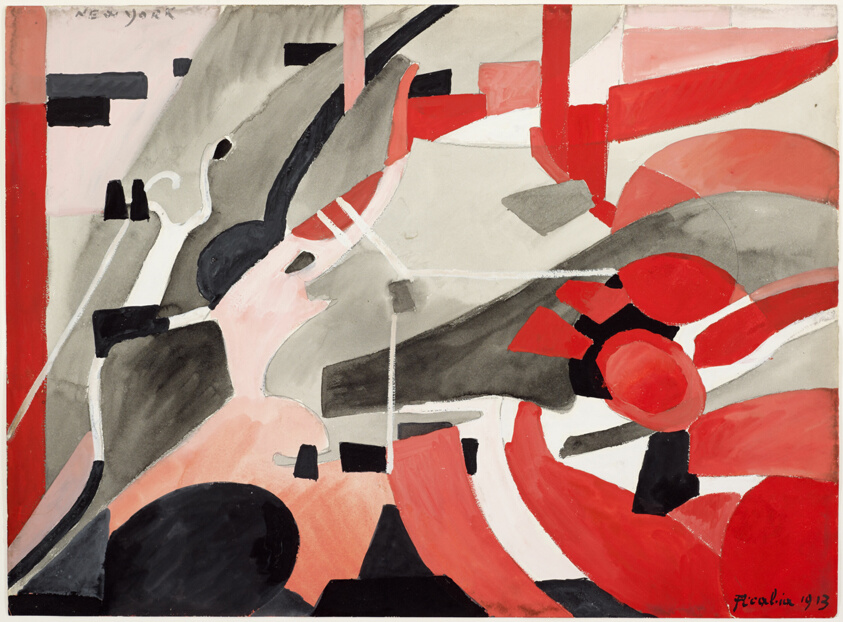
New York
Picabia's collage of red, black, and gray forms treats the composition like a fragmented page of marks, where geometric abstraction performs the velocity and collision of written language.
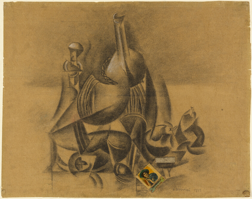
Collage with Box of Matches
Severini embeds an actual matchbox into charcoal drawing, making the readability of commercial text (a common object of everyday literacy) inseparable from the fine art mark.
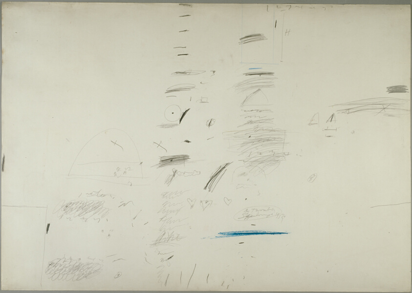
Sperlonga
Twombly's scattered graphite marks, paint traces, and gestural lines across near-white paper create a field that functions as a kind of personal notation system, closer to writing than to traditional drawing.
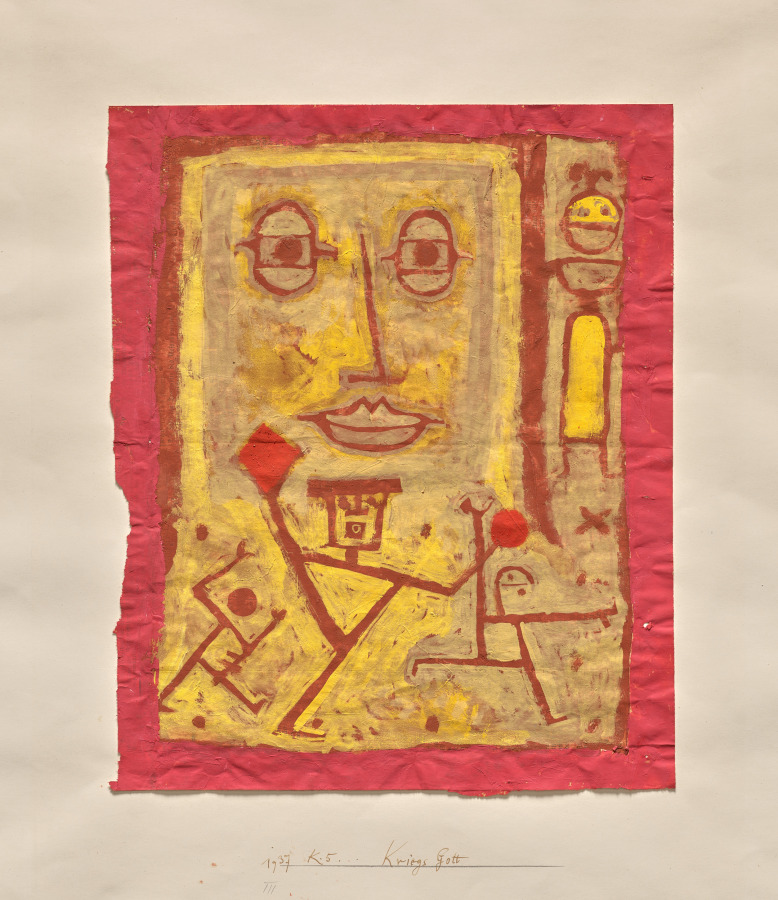
God of War
Klee's god rendered in red outline and yellow field transforms human and divine form into a quasi-alphabetic sign, where the body itself becomes a legible mark.
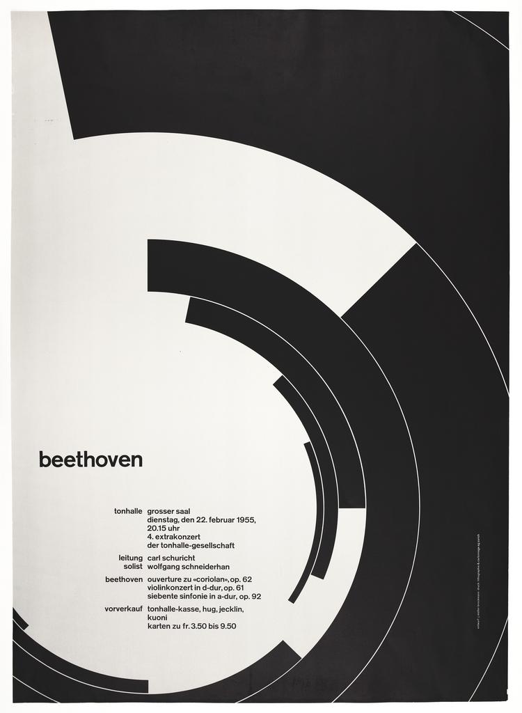
Beethoven
Müller-Brockmann's poster uses the word 'beethoven' as both text and sculptural form, integrating typography and geometric shape so completely that language becomes the work's visible structure.
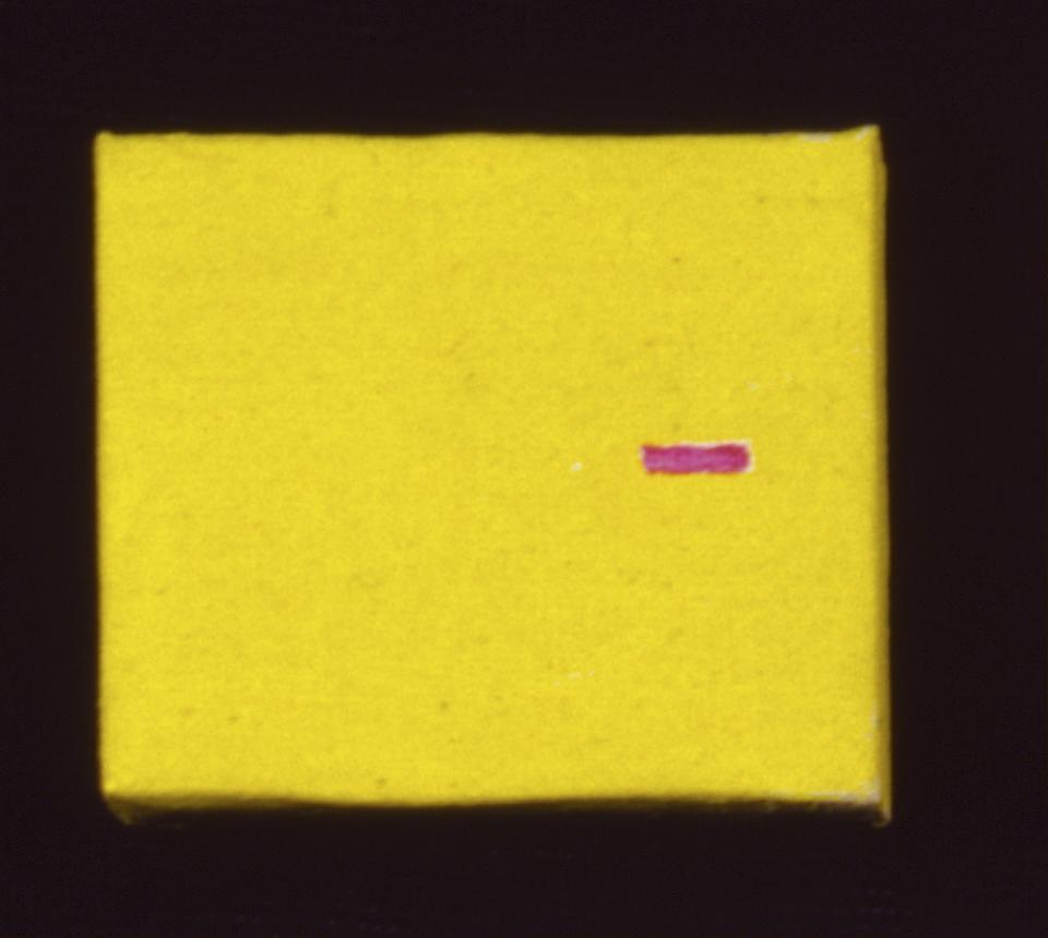
Micro-Painting
Davis's yellow field interrupted by a single magenta mark offers the minimal vocabulary of written gesture, a stroke, a color, white space, reduced to its most elemental notation.
The Review
The best moment in this show is the Twombly. Sperlonga is essentially white paper scattered with the debris of making: pencil scratches, some colored-pencil work, a blue line that reads deliberately. Nothing is finished. Nothing asks to be read as a composed gesture. And yet every mark arrives at exactly the angle and weight it needs. The eye does not search; it moves through the work as if following handwriting that happens to be abstract. That is the whole problem with most writing-in-art shows: they mistake intention for execution. A word burned into canvas is still just a word. A dash across paper becomes a mark only if the hand that made it knew where to put it.
Picabia's New York has that quality too, though it works differently. The watercolor sits between collage and pure abstraction. Red forms push and overlap; black shapes dig in like punctuation. The composition reads left to right, top to bottom, almost like a page folded and refolded. The paper itself shows through. There is no irony, no claiming to be about language while remaining utterly wordless. The work says what it does.
The Klee suffers from cuteness. God of War presents a figure that might be a letter or might be a body, and the painting seems satisfied with that ambiguity in a way that feels slight. The yellow is warm enough, the red outline direct enough, but there is no pressure here, no sense that making this particular mark mattered more than making any other. Compare it to the Müller-Brockmann lithograph, where the word 'beethoven' gets stretched and curved until typography and negative space become inseparable. The type is not set down; it is pulled open. The poster knows exactly what it is doing with every inch of the surface.
Severini's collage with matches is clever and clean. The integration of the real object reads as a technical fact rather than a conceptual one, which may be its strength. The charcoal drawing around the embedded box moves with precision; the artist has not needed to argue why text matters because the text is simply there, a thing among marks. Davis's late piece is harder to account for. A nearly monochrome yellow surface with one magenta stroke could mean almost anything, or nothing. It is the most abstract thing in the room and also the least committed to any argument about writing. That it works at all comes down to the exactness of the color choice and the placement of that single dash. Everything rests on whether that stroke looks inevitable or arbitrary, and from across the room it holds.
What the show does not do is make any claim about what writing actually is or why these six artists needed it. It presents the work and assumes the eye will find the connection. Sometimes that is enough. Sometimes it feels like a curator backing away from a real argument.
- +Twombly and Picabia repay close looking with formal exactness that justifies their inclusion on visual grounds alone.
- +The progression from collage to abstract mark makes a genuine formal argument without leaning on artist biography.
- +Müller-Brockmann's integration of type and space demonstrates that the premise works across applied design as well as fine art.
- –Davis's monochrome late work feels tangential to the exhibition's core claim about language and mark-making.
- –Klee's piece reads as decorative alongside works that demand the eye work harder.
- –The show presents its premise without developing why these six artists and these six moments specifically matter to the story it is telling.
- Kurt Schwitters →His Merz works assembled found text and printed ephemera into compositions that made readability inseparable from collage structure.
- Russian Constructivism →Typography and text were weaponized as visual form in revolutionary design; the movement's integration of language into composition precedes and shapes much of what this show examines.
- Joan Mitchell →Her gestural abstraction, though non-representational, demonstrates the alternative path of making marks that read as personal notation without reference to actual language.
- Robert Motherwell →His collages and gestural works navigate the space between written mark and abstract form in ways that extend the show's central question into color and scale.

Standing in front of these six works, I find myself pulled in two directions at once. The show does make an argument, but it is a narrower and more formal one than its title suggests, and that narrowness is both its strength and its real limitation.
Sperlonga arrests you immediately. Cy Twombly has laid down pencil, colored pencil, and paint across paper in what appears at first to be scattered notation, but the accumulation of marks has a rhythm that your eye genuinely follows. There is no finished image underneath the marks; the marks are the image. A blue line sits alone in the lower register like a single word placed at the end of a sentence. The work does not claim that abstraction is writing; it shows you what it looks like when a hand that understands writing learns to make marks that have nothing to say except themselves. Kessler was right about the inevitability here, and I want to push further: what makes Sperlonga work is that Twombly has understood that to write without content is to write the hand itself. The marks are gesture without sentiment.
Picabia's New York, which hangs nearby or should, moves in the opposite direction. The watercolor layers red and black shapes in a composition that does read left to right, top to bottom, like a page or a diagram. But unlike Twombly, Picabia is composing with intention; the shapes are not notation but architecture. The way the black forms cut into or sit behind the red creates a spatial depth that suggests type, suggests language, without ever settling into letters or words. The white paper showing through is not accident but air. What is remarkable is that this 1913 work avoids both the trap of literal text and the trap of claiming abstraction is secretly writing. It simply holds the energy of written composition without needing either the words or the performance of gesture.
The Müller-Brockmann Beethoven poster works at a different register entirely. This is the one piece here that explicitly makes language its subject while treating that language as pure form. The word 'beethoven' has been warped into concentric arcs; the type is stretched, curved, made sculptural. Typography and negative space have become the same thing. The lithograph knows that in graphic design, the word is not being protected or elevated; it is being used up, consumed by the demands of visual balance. There is something almost violent about how thoroughly the letterforms have been subordinated to the geometry of the page. It is the opposite of what happens in Picabia and Twombly, where abstraction approaches language. Here, language approaches abstraction by being flattened and curved until it becomes structure.
The three remaining pieces do less work. Severini's Collage with Box of Matches sits on the page like a demonstration of a Futurist idea rather than a complete thought. The embedded box of matches is literalist in a way that feels safe, a proof of concept rather than a conviction. Klee's God of War has the same problem in reverse. The figure might be a letter or might be a body, but the painting seems content with that status rather than pressing the ambiguity into something that matters. The warm yellow and red outline have facility without necessity. And Gene Davis's Micro-Painting, a nearly monochrome yellow rectangle with one magenta stroke, sits so far outside the stated project that it reads as either a joke or a mistake. A single colored line on a yellow ground does not argue for anything about writing. It is minimalism without argument, and the exactness of the color choice, which Kessler praised, only underscores how little the work has to do with language or marks or the written gesture that unites the stronger pieces here.
What troubles me most is what the show refuses to ask. These six artists span from 1912 to 1966, from Futurism to late abstraction, from Dada's appropriation of printed matter to Swiss graphic design's formalization of typography. But the exhibition does not interrogate what these different uses of writing mean for art's relationship to literacy, mass production, communication, or power. Does embedding a box of matches in 1912 say something different than Twombly's abstracted mark-making in 1959? Is the graphic designer's use of typography in a concert poster fundamentally different from the fine artist's use of abstraction that reads like writing? The show sidesteps these questions. It presents the works and assumes that the eye will find the connection, which is Kessler's criticism exactly.
But I want to push back slightly on where she lands. The show is not incoherent; it has a real formal thesis about how modern art made marks that read like language, or language that reads like marks, depending on your vantage. That thesis holds for five of the six pieces. What the show is missing is not coherence but courage. It could have asked whether this formal gesture, repeated across movements and decades, reflects something about modernism's anxiety about meaning itself. It could have asked whether making writing visible and abstract simultaneously is a way of preserving meaning while denying it the power to communicate. It could have asked whether these artists were rescuing language from instrumentality or just relocating it to a space where it could not do any harm. Instead, it trusts the eye and steps back.
- +Sperlonga and New York together demonstrate a genuine formal insight about how abstraction can approach writing from different angles without claiming to be it.
- +Müller-Brockmann's Beethoven shows real curatorial nerve by including a graphic design piece that complicates the notion of 'modern art' and reveals typography as sculptural practice.
- +The visual and formal range across the six works, from charcoal collage to lithography to acrylic abstraction, creates genuine variety even when the argument does not.
- –The show refuses to ask what these different approaches to writing and marking mean historically or politically, settling for formal observation instead of interpretation.
- –Three of the six pieces (Severini, Klee, Davis) feel included to fill a roster rather than to make or complicate an argument; they neither strengthen nor challenge the thesis.
- –The gap between 1913 and 1959 is never addressed, leaving the show unable to explain what changed in how artists thought about marks and language across four decades of radical upheaval.