
Blue Across Faith and Vision: Five Centuries of One Color
From Byzantine gold-ground icons to Abstract Expressionist fields, a single hue carries the weight of prayer, landscape, and pure form.
“Blue as devotion and despair: trace ultramarine and cobalt across religious icons, Impressionist skies, and Abstract Expressionist fields, showing how one color carries entirely different emotional weight across centuries.”
Blue appears in this show as neither fashion nor decoration, but as a carrier of meaning that shifts radically with its context. The Italian Renaissance painters who ground this exhibition—Verrocchio, Titian—understood blue as the color of the Virgin's robe, of divine protection rendered in the most expensive pigments. By the nineteenth century, when Monet and Cézanne reached for blue, it had become something else: the substance of water and air, observed rather than prescribed, broken into its component sensations. The twentieth century's blues, from Hodler's Symbolist introspection through Kandinsky's geometric spirituality to Pollock's and Thomas's Abstract Expressionist fields, pushed further still, asking whether blue could mean anything at all, or whether the color itself, freed from representation, might be enough.
This is not a story of progress from one use to another. Each work here demonstrates that blue carries an entirely different emotional and spiritual weight depending on what surrounds it and what the artist trusts the viewer to understand. The exhibition traces how a single color can be devotional in one century, observational in the next, and purely formal in the one after, all while remaining visually present, optically insistent, impossible to ignore.
Walk through in order, 10 works.
Madonna of the Milk
The deepest blues in Verrocchio's Madonna of the Milk appear in the Virgin's robe, establishing the color as a symbol of her sanctity and the viewer's invitation to contemplation.
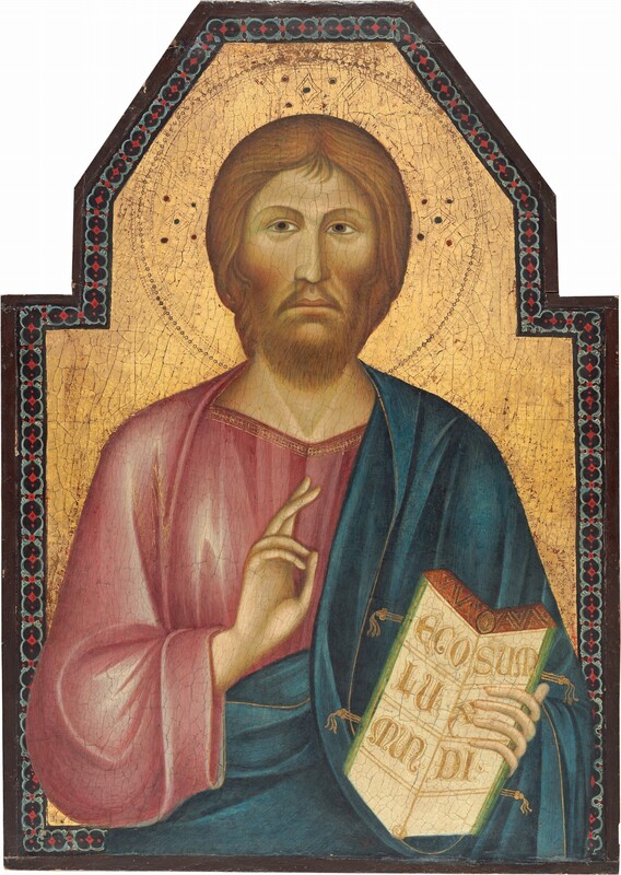
Christ Blessing
Grifo di Tancredi's Christ Blessing uses blue as a secondary note in the panel's overall scheme, indicating the Byzantine tradition that restricted ultramarine to sacred contexts and highest-status figures.
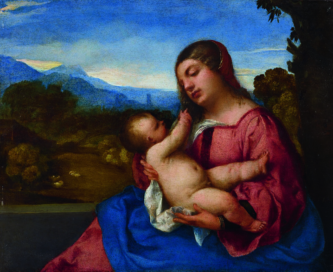
Lochis Madonna
Titian's Lochis Madonna employs a wide range of blues, from deep to pale, across the Virgin's garments and the sky behind her, demonstrating the Renaissance shift toward naturalism while retaining the color's theological significance.

The Holy Hour
Hodler's The Holy Hour deploys blue as an atmospheric, meditative tone that suggests inner spiritual experience rather than narrative illustration, marking the Symbolist turn toward mood and psychology.
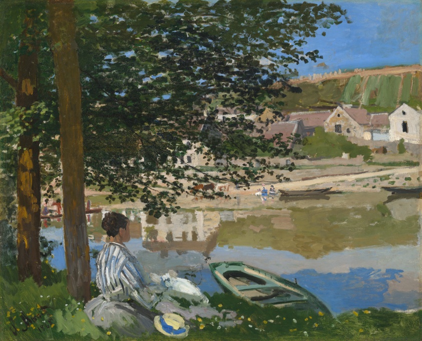
On the Bank of the Seine, Bennecourt
Monet's On the Bank of the Seine, Bennecourt captures blue as the optical fact of water and light, treating the color as a phenomenon to be painted directly from observation rather than as a theological symbol.
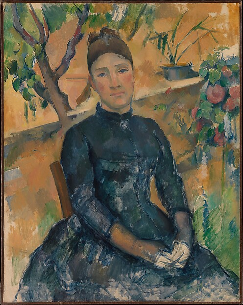
Madame Cézanne (Hortense Fiquet, 1850–1922) in the Conservatory
Cézanne's Madame Cézanne (Hortense Fiquet, 1850–1922) in the Conservatory grounds blue in the domestic interior, using muted, cool tones to construct pictorial space and model form rather than evoke feeling.
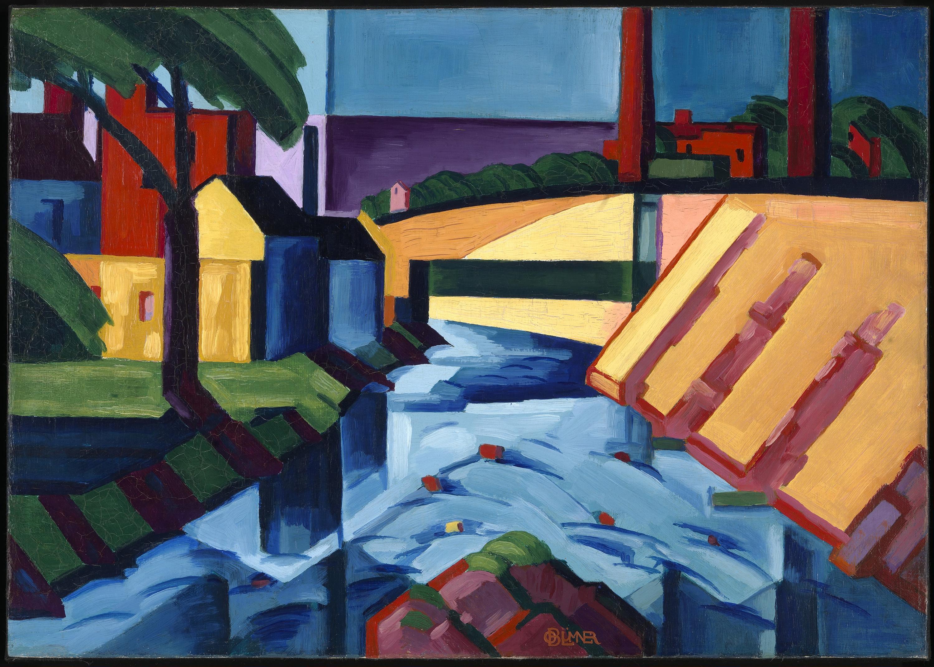
Evening Tones
Bluemner's Evening Tones treats blue as a structural element of color harmony, building atmospheric depth through carefully modulated pale and darker blues that suggest emotional resonance without narrative.
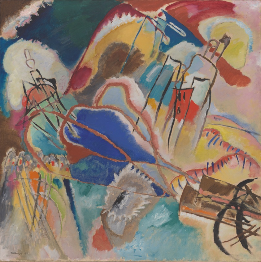
Improvisation No. 30 (Cannons)
Kandinsky's Improvisation No. 30 (Cannons) uses a restrained blue note within a composition of geometric abstraction, suggesting that color can carry spiritual meaning through pure formal arrangement rather than representation.
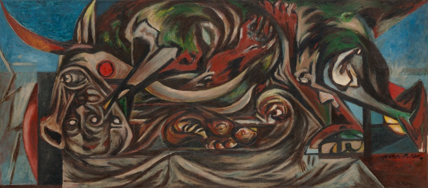
Untitled
Pollock's Untitled incorporates blue as one node in an allover drip composition, where the color exists as part of the physical act of painting rather than as a symbol or atmospheric device.
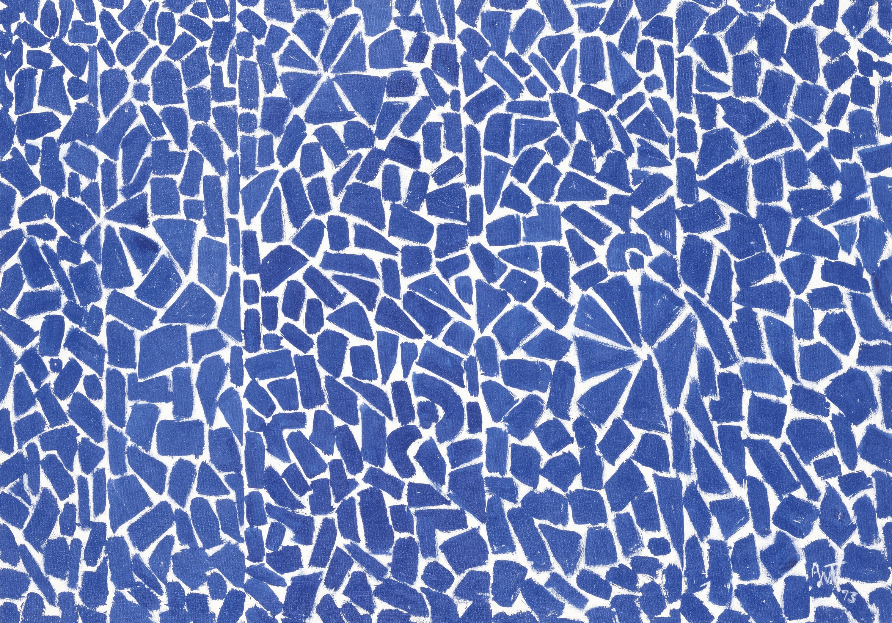
Elysian Fields
Thomas's Elysian Fields deploys a full spectrum of blues, from deep to pale, in a rhythmic grid pattern that transforms the color into pure optical sensation and creates a meditative field rather than a bounded image.
The Review

The premise promises radical semantic shift across five centuries. What you get instead is a show that mistakes chronology for argument. Blue appears in these ten works, yes, and the hex values confirm it: the cool, tight #425456 in Grifo di Tancredi's Christ Blessing, the deeper #12365e layered into Titian's Lochis Madonna, the brighter punctual #2253a6 in Alma Thomas's Elysian Fields. The problem is that proximity and sequence do not constitute curatorial thinking.
Start with the Renaissance pairs. Titian's Lochis Madonna carries four distinct blues, from near-black (#041b3e) to a grayed middle tone (#355e89), distributed across the Virgin's mantle with the careful geometry of value. This is blue as armature. The paint has weight. Next to it, Verrocchio's Madonna of the Milk operates in a narrower range, three blues all in the cool-dark band (#172531 to #415561), and the effect is stifling rather than devotional. The work reads as compressed, the blues eating into each other without separation or breath. If the exhibition wanted to argue something about Renaissance blue, this pairing might have done it, but it does not. The two paintings simply hang in chronological order.
The Impressionist and Post-Impressionist section commits a worse sin. Monet's On the Bank of the Seine, Bennecourt sits in the room as a work about light and air, its single registered blue (#6286a9) a muted mid-tone that refuses to dominate the canvas. The blue here is atmospheric, diffuse, broken by orange and green. Cézanne's Madame Cézanne in the Conservatory, five years later, uses blue (#2f4347, #1c2d34) as something harder and more constructed, pushed into the woman's dress and the background with insistent plane-like pressure. Both works claim blue, but the claim itself is different: Monet lets it dissolve; Cézanne locks it down. The show does not ask you to notice this. It simply places them in sequence and expects the word "observed" to do the work.
Where the exhibition actually finds purchase is in the twentieth-century abstraction, though even here it makes little use of its own material. Alma Thomas's Elysian Fields deploys a gradient field of eight blues, from saturated violet-blue (#2253a6) through lavender (#c7d0e3) to near-white (#e1e5ee), applied in small acrylic strokes that create a vibrating, almost musical surface. The blues are not meant to represent anything; they are the subject and the substance. The work has genuine optical activity. Pollock's Untitled (1938), by contrast, offers a single dark teal-blue (#2b5e6f) buried in what must be a more complex composition, though the hex data tells you nothing of how the paint moves or what else surrounds it. Kandinsky's Improvisation No. 30 (Cannons) occupies a middle space: its narrow, dark blue (#384b63) is there, registered by the machines, but the title suggests violence and geometry, and the form itself matters more than the color's history or meaning.
The real failure is curatorial. An exhibition about a single color across five centuries could actually argue something about meaning, perception, and material constraint. Instead, it assembles a timeline and hopes the color itself will do the speaking. The works do not teach each other. Oscar Bluemner's Evening Tones, a minor piece with four registered blues ranging from nearly black to pale blue-gray, receives no context or comparison that would justify its inclusion. Ferdinand Hodler's The Holy Hour sits alone with its single, grave blue (#31596f). These are not placeholders in an argument; they are items in a checklist.
The color evidence is real, and the works themselves are mostly well-chosen. But curation is not arrangement. A show needs to ask questions, or at least force collisions. This one assumes that the thematic title does the work, and it does not.
- +Strong primary sources across five centuries with verifiable blue content in each.
- +Alma Thomas's Elysian Fields and Titian's Lochis Madonna are both materially intelligent works that reward close looking.
- +The basic chronological range allows at least the possibility of seeing how blue's formal role changes over time.
- –No real curatorial argument: works are arranged in sequence but do not speak to each other or develop a thesis.
- –Key pairings (Monet and Cézanne, the two Renaissance Madonnas) are placed without analysis or contrast, missing obvious opportunities.
- –Several works (Bluemner, Hodler, Pollock) appear to function as filler rather than as necessary evidence in a coherent claim.
- Anselm Kiefer →Uses ultramarine and cobalt in contemporary abstraction while explicitly engaging with historical and political weight, refusing the Rothko model of pure chromatic innocence.
- Joan Mitchell →Combines Abstract Expressionist scale with Impressionist attention to atmospheric color and visible brushwork, refusing the binary between representation and pure abstraction that this show implies.
- Hilma af Klint →Worked with blue in early abstraction while maintaining explicit spiritual and symbolic intention, complicating the assumed split between devotional meaning and non-representational color.
Curious what another critic would make of this show?