Form and Conviction: Geometry from Revolution to Reduction
How pure geometric form carried opposite meanings in Soviet Russia, Bauhaus workshops, and American Minimalism.
“Geometry as ideology: Russian Constructivism, Bauhaus design, and Minimalism, tracing how form-follows-function meant something different to a revolutionary, a reformer, and a New York gallery decades later.”
Between the 1920s and 1960s, three distinct movements embraced geometric abstraction and industrial simplification, but each deployed these tools toward radically different ends. Russian Constructivism weaponized geometry as propaganda for a utopian socialist future, designing posters and objects meant to reshape consciousness and collective life. The Bauhaus reformers believed good design could elevate everyday experience through rational form and honest materials, democratizing beauty for ordinary people. American Minimalism, emerging in the 1960s, stripped geometry down to pure sensation and perception, divorcing form from function or social mission entirely. What looks like a shared language of lines, grids, and reduction was actually three separate arguments about what art and design could do in the world.
This exhibition traces how the same visual vocabulary meant liberation, improvement, and finally a kind of aesthetic autonomy, depending on who was holding the pencil and what they believed their work could change. The roster moves across nearly a century of geometric reduction, but not in a smooth arc. Instead, it reveals the fractures: where form served ideology, where it aimed at social reform, and where it became an end in itself. By placing these moments of conviction alongside one another, the show asks whether geometry itself is neutral, or whether every grid and every angle carries the fingerprint of what someone wanted the world to become.
Walk through in order, 10 works.
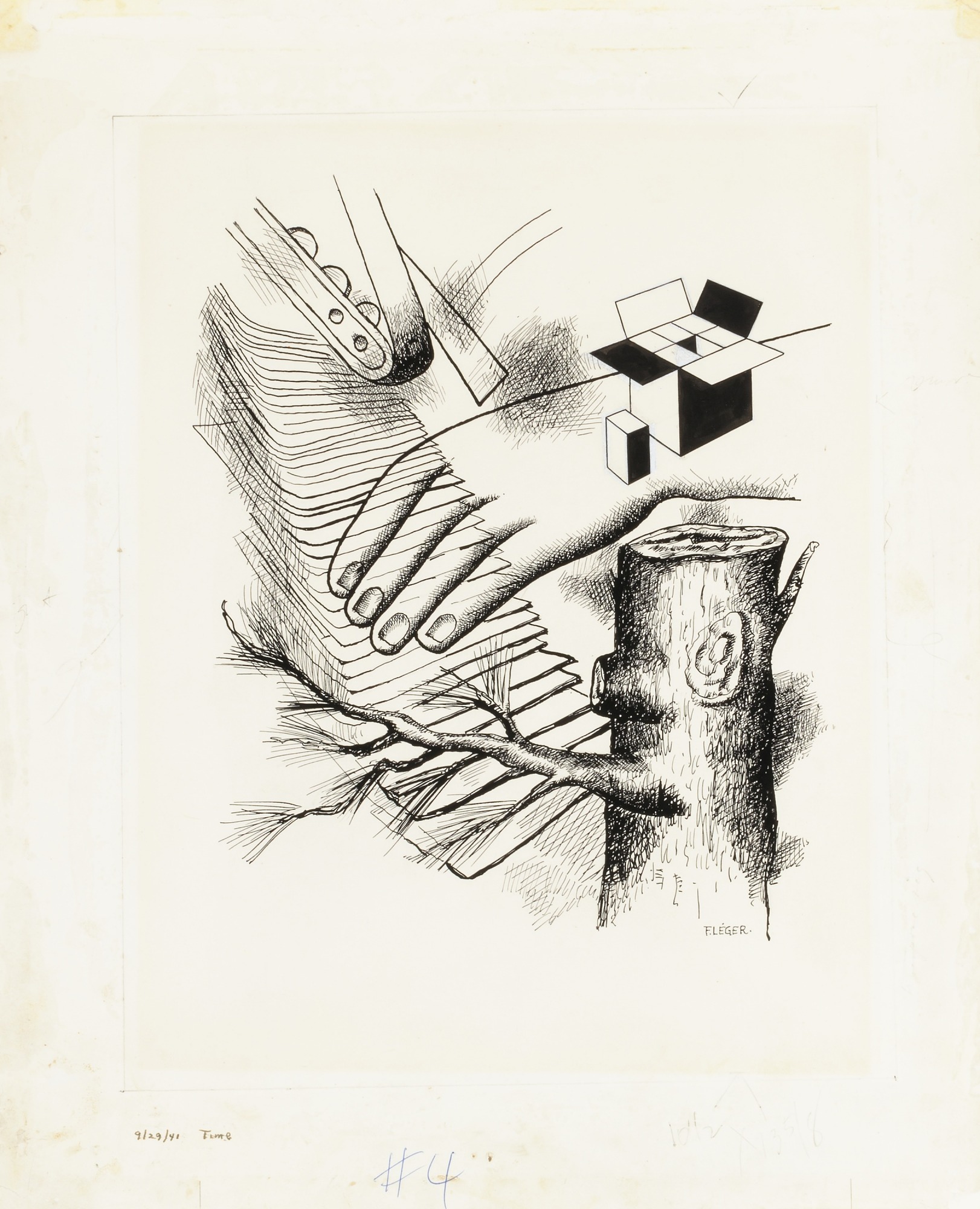
One, from the Early Series
Léger's cubist pen work bridges Constructivism's geometric vocabulary and fine art, showing how simplified forms could articulate the modern machine age without explicit propaganda.
![1960/61 Stadttheater Basel [Poster for the 1960-61 Season of the City Theater, Basel]](https://pub-45dcf715ffe54ded939bd0210dffb014.r2.dev/artworks/ch-212100.jpg)
1960/61 Stadttheater Basel [Poster for the 1960-61 Season of the City Theater, Basel]
Hofmann's Basel theater poster exemplifies Swiss Style's belief that geometric clarity and typography could communicate function and beauty simultaneously to ordinary viewers, a Bauhaus ideal made into professional practice.

Chess Set
Man Ray's Chess Set merges Dada's conceptual irreverence with the Constructivist dream of redesigning everyday objects, yet undermines both by rendering the game itself in precious materials, turning utility into luxury.
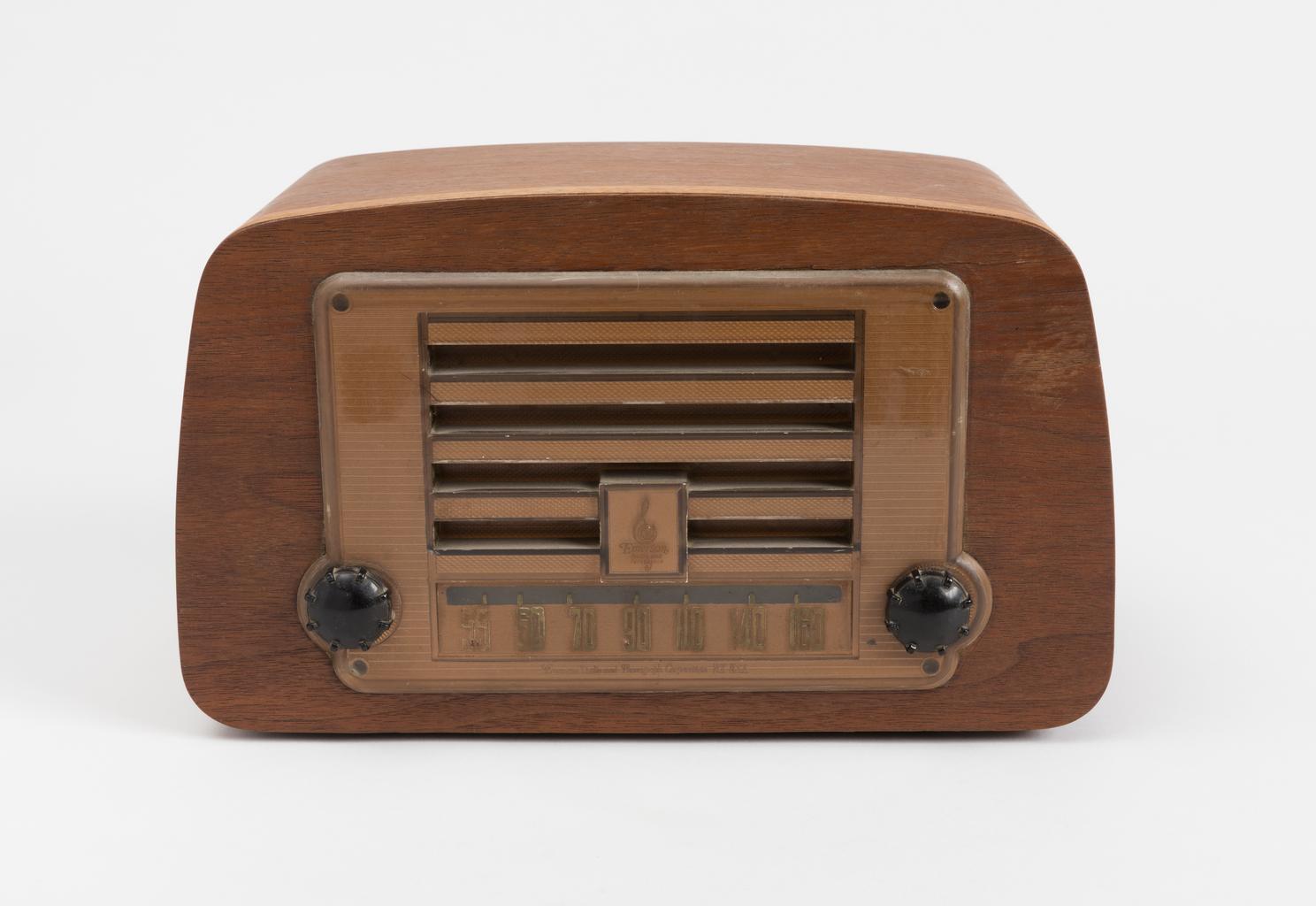
Radio
The Eames Radio applies modernist reduction to industrial production, treating bentwood and plastic as honest materials that serve both function and form, the Bauhaus reformist principle made commercial.
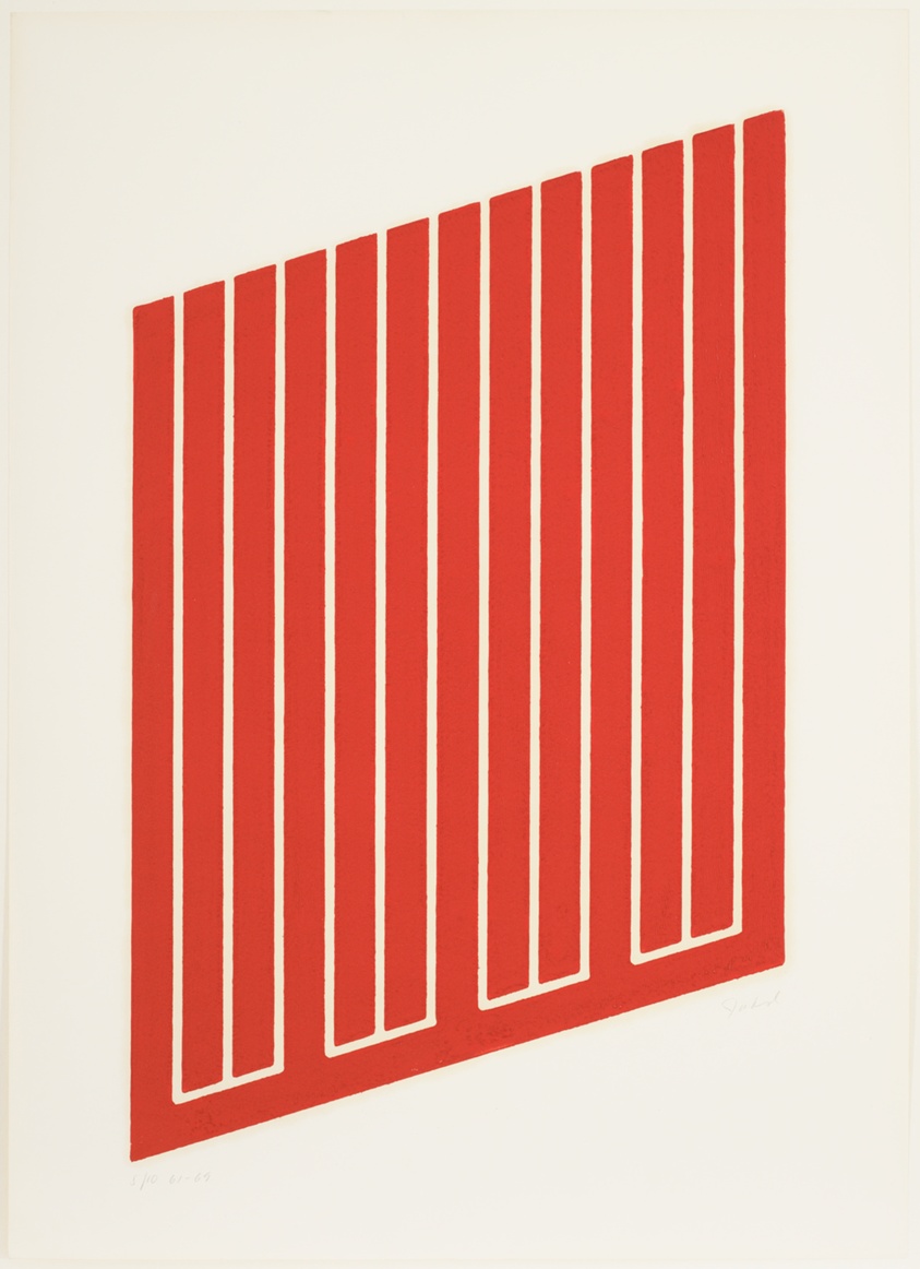
Orange Grid Design Series
Judd's Orange Grid Design Series strips geometric form to its absolute essence, a grid reduced to pure visual fact without propaganda, pedagogy, or use-value, the end point of form's journey toward autonomy.
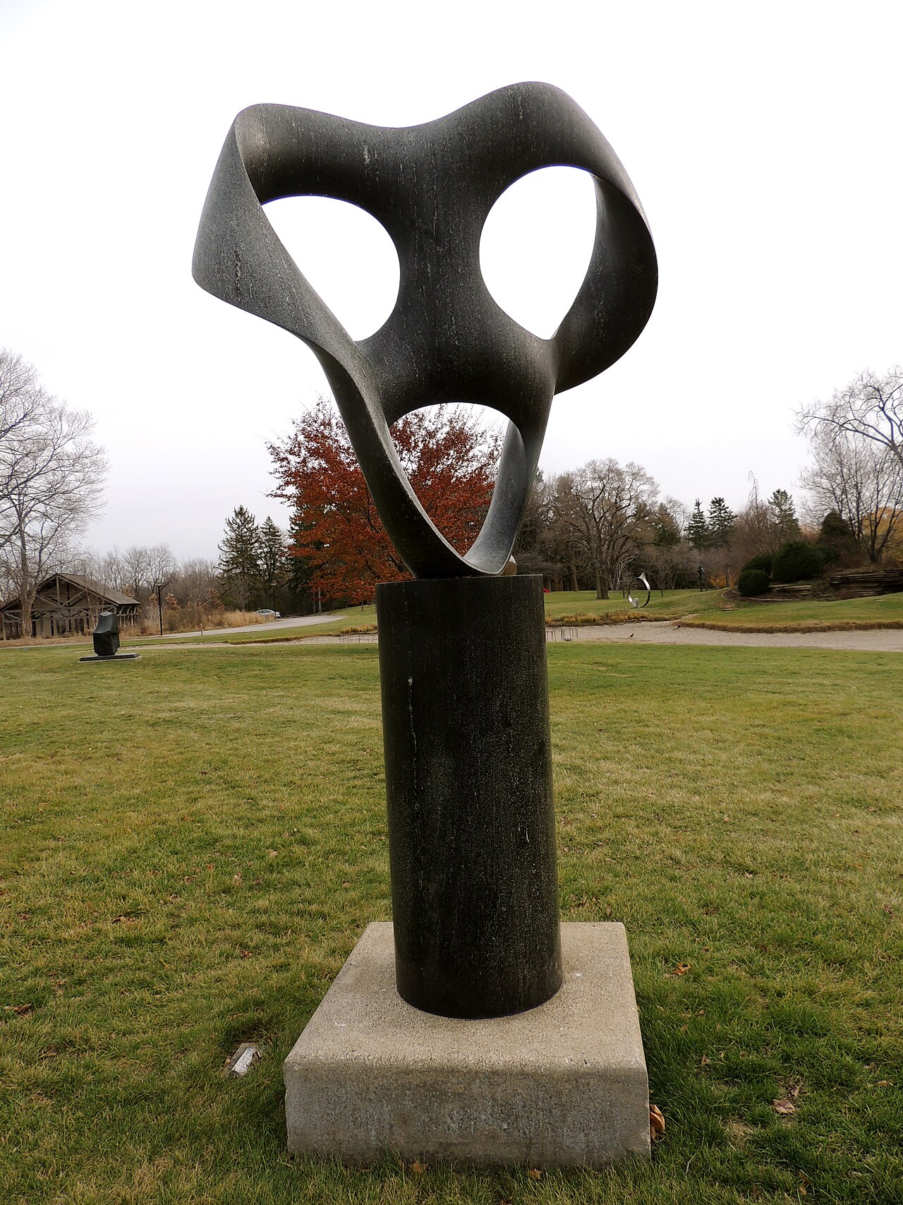
Rhythm in Space
Bill's Rhythm in Space carves geometry into diorite, a solid mass that contains and articulates rhythm through shape alone, synthesizing Swiss constructivist precision with sculpture's physical presence.
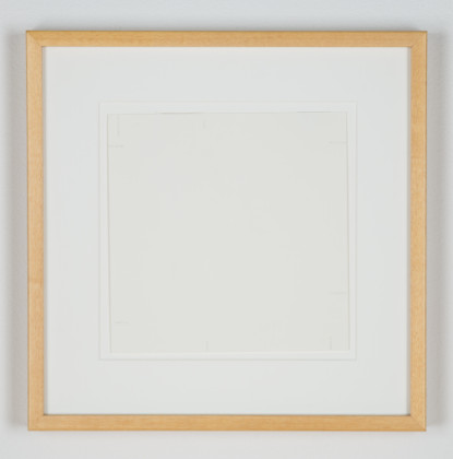
Untitled
Barry's 1978 Untitled uses diluted ink to dissolve geometric certainty into barely-there marks, a Minimalist reduction taken so far it approaches invisibility, questioning whether geometry needs to exist at all.
Untitled
Barry's second Untitled combines diluted ink and silver pencil to create geometry that hovers between presence and absence, a meditation on how thin the line is between form and its absence.
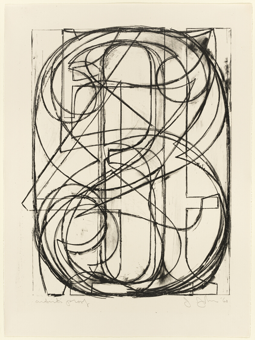
0 Through 9
Johns' 0 Through 9 applies serial geometric logic to the readymade world of numbers and symbols, asking whether reduction and replication serve meaning or undermine it, a pivot from Minimalism toward irony.

"Untitled" (For a Man in Uniform)
Gonzalez-Torres' Untitled (For a Man in Uniform) uses candy's geometric heap as memorial and refusal, collapsing the distance between functional geometry and vulnerable form, the ideology of shape undone by loss.
The Review

The premise here is actually solid: trace how the same formal vocabulary, grids, reduction, pure geometry, got conscripted into three utterly opposed worldviews across a century. That's a real question. The curatorial note even promises fractures, not smoothness. But the execution collapses almost immediately into a safe historical survey that doesn't know what to do with its own argument.
Start with the roster itself. Ten works, nine artists, all men. That's not incidental. The show claims to track conviction across movements, yet somehow conviction arrived only through the male perspective in all three moments. More damning: there's almost no actual contact between the works. Man Ray's Chess Set sits alone in its Dada moment, doing nothing but being precious. It's a folded readymade exercise from 1927, beautiful in its material precision (brass, silver, gold, that silk-lined case), but it's neither Russian nor Bauhaus nor Minimalist. It's a non-argument. Why is it here? The show doesn't say. It just wants you to notice geometry and move on.
The Bauhaus angle should be where the show's bones show. Ray Eames' Radio from 1940, that bentwood and plastic object, is genuinely intelligent about how form can address function without becoming propaganda. But it sits mute next to Armin Hofmann's 1960/61 Stadttheater Basel poster, which is a Swiss Style monument to clean information design. Two objects from the design-reform tradition, but the show never makes them talk to each other. What changed? What stayed? What was lost in the gap between a functional radio and a purely typographic grid? The poster is sharp, economical, almost aggressive in its confidence that geometry alone can direct public behavior. The radio is softer, more compromised, accepting that people need to hold things. But this friction goes unnamed.
Then there's Donald Judd's Orange Grid Design Series from 1961. A cadmium red woodcut. This is where the show's central thesis should ignite, where geometry divorces itself from social use and becomes perceptual fact. Instead, Judd's grid gets filed into a checklist alongside Jasper Johns' 0 Through 9 from 1960 (a lithograph of, yes, numbers in a grid) and two Robert Barry untitled drawings in diluted ink. The Barry pieces are near-invisible, the kind of works that demand close looking and patience. They get no room to breathe. Johns' lithograph is conceptually clever but visually timid, just numbers on cream paper. None of these works actually makes the case for Minimalism as something that freed geometry from function. They just sit there, numbered, as if being early versions of themselves is enough.
Fernand Léger's One, from the Early Series (1941) is a pen-and-ink drawing, Cubist, geometric but warm, industrial but playful. Max Bill's Rhythm in Space (1967) is diorite, sculpture, austere. Felix Gonzalez-Torres' "Untitled" (For a Man in Uniform) (1991) is candy. Candy. The show doesn't mention this candy work at all in its framing, which means it arrived as an afterthought, or the curation genuinely couldn't figure out how a pile of wrapped sweets fits into its narrative about conviction and form. Spoiler: it doesn't, and that's the most interesting failure in the room.
What the show refuses to do is actually argue. It wants you to see three columns of geometry and accept that they're three different things. But it provides no collision between works, no pairing that makes the argument visible. Constructivism against Bauhaus? Not represented side-by-side. Bauhaus against Minimalism? The works are there, but separated by medium, era, and an explanatory text that does all the thinking. There's no moment where standing in front of two objects in the same room makes you feel the difference in their conviction. The curation is a proof-by-assertion, not by evidence.
- +The central premise is genuinely provocative: tracing how geometric form carried opposite meanings across three distinct political and aesthetic moments.
- +Individual works like Ray Eames' Radio and Armin Hofmann's poster are formally sophisticated and make real arguments about design's social role.
- +Spans nearly a century with genuine historical depth, not a shallow thematic survey.
- –The roster is entirely male across all three movements, which either means the curator couldn't find women in these traditions or didn't think to look, both failures.
- –Works sit isolated rather than in active dialogue; the show tells you the argument instead of staging it where the pieces meet.
- –Includes works like Man Ray's Chess Set and Felix Gonzalez-Torres' "Untitled" (For a Man in Uniform) that have almost no relationship to the stated thesis, suggesting uncertain curatorial grip.
- Sol LeWitt →LeWitt's wall drawings and grid systems take geometric reduction to its logical extreme, making the instructions matter more than the execution, a direct escalation of where Judd leaves off.
- Agnes Martin →Martin's geometric grids and lines carry a spiritual or meditative dimension that neither Constructivism nor Bauhaus nor American Minimalism fully account for, completing the conversation this show starts.
Curious what another critic would make of this show?