Almost Nothing: Art at the Edge of Presence
Five artists who stripped form down to its breaking point, where minimalism risks disappearing entirely.
“8 artists dealing with minimalism that is too minimal”
Minimalism promised reduction to essentials, but what happens when an artist keeps reducing? This exhibition gathers eight works that hover at minimalism's frontier, where the gesture becomes nearly invisible, the mark barely registers, or the object threatens to vanish into the wall. These are works that trust the viewer's eye to complete what is barely there, that find expression in near-absence, and that ask whether something this spare can still be art at all. They represent a shared conviction that less can actually become too little, and that the space between presence and dissolution is where real risk lies.
These artists worked across different decades and media, but they shared an impatience with minimalism's orthodoxy. Some used the poorest materials (cardboard, chalk, a monotype plate). Others reduced gesture to a single line, a slight incision, or a whisper of color. A few made work so austere that documentation itself becomes necessary proof the work existed. What unites them is a willingness to move past minimalism's confidence in the power of the reduced form, into a territory where emptiness itself becomes the content, and where the viewer must decide if what they are seeing is finished art or unfinished gesture.
Walk through in order, 8 works.
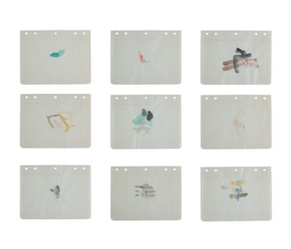
Loose Leaf Notebook Drawings - Box 3, Group 7
Nine watercolor sketches of barely-there figures and forms on index cards, each one reduced to the minimum gesture needed to register as a subject, testing whether a whisper of color can still claim to depict anything at all.
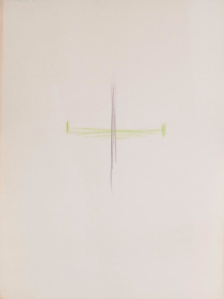
Intersecting (Purple and Green)
Two intersecting lines, one purple and one pale yellow, drawn with colored pencil on near-white paper, holding the entire weight of the composition on the tension of their meeting point.
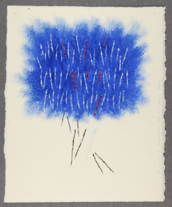
Untitled
A dense blue oil pastel cloud shot through with incised lines and red marks, the pastel's soft haze contradicted by the hard scratched lines beneath, making the image feel both formed and erased at once.
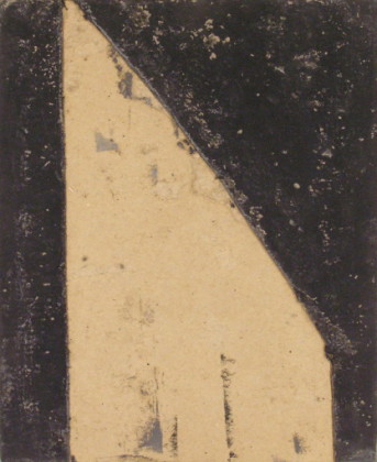
Monotype plate
A painted cardboard monotype plate from 1977, showing a geometric triangle shape divided and marked, the plate itself (in all its material poverty) treated as the finished object rather than a means to an end.
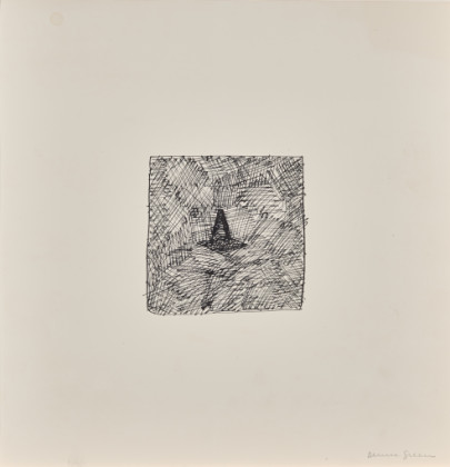
Untitled (Drawing Plus Documentation Sheet)
A small grid of ink marks barely visible against white paper, accompanied by a documentation sheet that seems to confirm the work existed only because without it the drawing itself nearly disappears.
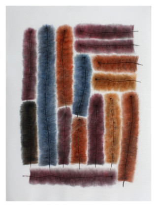
Furrows #15
Vertical and horizontal chalk pastel strokes in rust, blue, and burgundy tones, scored with incised lines that cut through the soft pigment, making absence as important as the colored marks themselves.
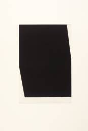
Concorde II (State)
An etching and aquatint that reduces the Concorde jet to a silhouette defined almost entirely by negative space and the thinnest of line work, the state proof format underlining that even a masterwork of minimalism is still a work in progress.
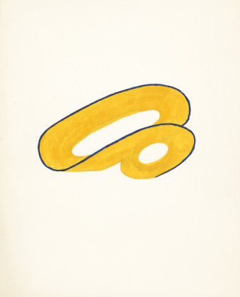
Blue and Orange
A simple yellow acrylic shape, almost a curved bracket or parenthesis, edged in black, set alone on white paper, so basic in form that it risks reading as something unfinished or accidental rather than composed.
The Review
The show hangs thin on purpose, which is almost always a mistake. Almost Nothing tries to make a virtue of it. The eight works are genuinely spare, and in some cases actually difficult to see, but that difficulty does not automatically mean they are good, and it certainly does not mean a room full of them argues anything coherent.
Richard Tuttle appears three times, and at least in Loose Leaf Notebook Drawings - Box 3, Group 7, the gesture is so attenuated it stops meaning anything. Nine index cards, each one carrying a watercolor so light it barely reads as pigment at all. The question is not whether the viewer can complete what is barely there, but whether there is anything to complete in the first place. In Intersecting (Purple and Green), two lines meet on white paper. That is actually stronger, because the composition has a real decision in it: the placement of the intersection, the slight difference in line weight between the purple and the yellow. The eye has something to do. But Blue and Orange is where Tuttle cracks the problem open, if only partially. A yellow acrylic form, simple as a bracket, holds the white around it. The form is reduced but it is not invisible. The shape has an edge.
Edda Renouf's Untitled from 1987 does something more interesting with absence. The dense blue oil pastel field, soft and almost cloud-like, is cut through with incised lines and red scratches that feel almost violent against the haze. The work is divided against itself: soft pigment versus hard marks, the pastel's natural blur against the sharp incisions. This is not minimalism retreating into near-nothing. This is minimalism fighting with itself. Furrows #15 uses the same strategy, colored chalk with incised lines, but the vertical and horizontal marks feel more systematic, more resolved. The incisions read as a deliberate method rather than a struggle.
The show's two best works are both about the object's resistance to becoming pure idea. Thornton Willis's Monotype plate is simply a painted piece of cardboard, the plate itself the artwork, dated 1977. There is no print run, no edition. The cardboard is pale, scored and marked, a triangle shape dividing the surface. It sits there as a used thing, neither precious nor gesturally ambitious, which is exactly why it works. It has weight because it has no pretense. Ellsworth Kelly's Concorde II (State) is technically more accomplished, the aquatint and etching defining a jet silhouette through negative space and the barest line work. The state proof format is crucial here, not because it proves something conceptual but because it shows the hand did the work, made choices about where to stop. The image could be complete or partial. That ambiguity is earned, not theoretical.
Denise Green's Untitled (Drawing Plus Documentation Sheet) is the show's oddest gesture. A small grid of barely-visible ink marks on paper, presented alongside the documentation sheet as if the documentation is the actual piece. It is too clever. The work collapses into an idea about documentation rather than standing as something the eye can actually encounter. The drawing itself is too faint to see, and so the documentation becomes necessary, which means the concept has won and the eye has lost.
The issue is scale. Five artists, eight works, all of them testing the edge of visibility, creates a room that feels like a provocation without any argument underneath it. The curator's wall text insists these works ask whether they are art at all, but they mostly do not ask that. They mostly just sit there, daring the viewer to find them interesting. That is not the same as risk. Risk requires something at stake.
- +Thornton Willis's Monotype plate and Ellsworth Kelly's Concorde II (State) both understand how to make restraint visible as a technique, not a concept.
- +Edda Renouf's two pieces show how incision and pigment can actually argue with each other rather than simply coexist.
- +The works are genuinely sparse enough to force the eye to work, which is rare in museum shows.
- –Several pieces cross from sparse into invisible, leaving nothing for the eye to actually do.
- –Tuttle's three works dominate the show without adding much beyond the first, which undercuts any argument about formal diversity.
- –The wall text treats near-disappearance as automatically equivalent to formal risk, which is flattering rather than honest about what actually works here.
- Agnes Martin →Martin's grids and linear work offer a comparison case of minimalism that achieves presence through repetition rather than reduction to nothing.
Curious what another critic would make of this show?